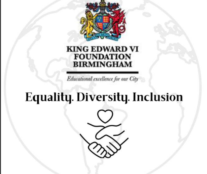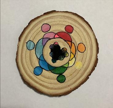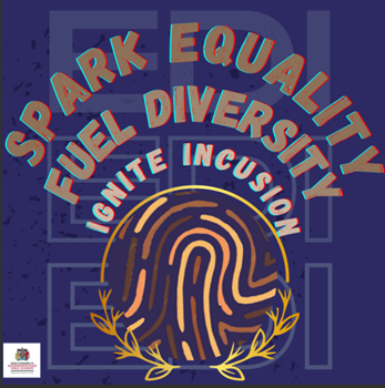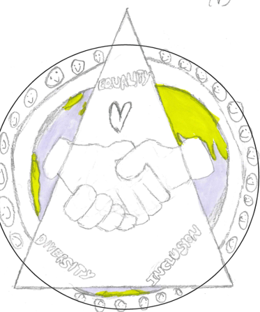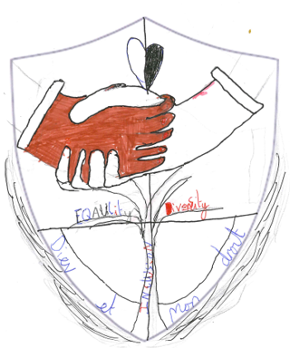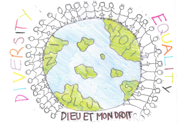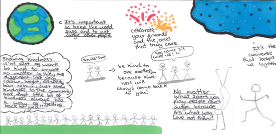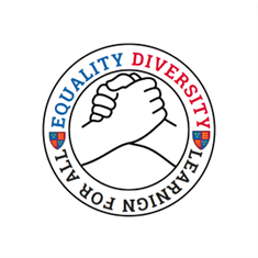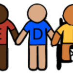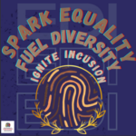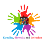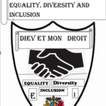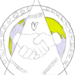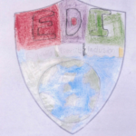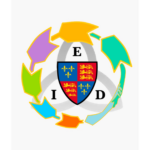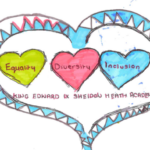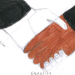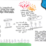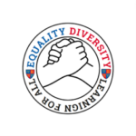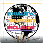
How does this logo represent EDI?
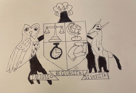
“The reason I picked this logo design is that every component of it signifies something from EDI. The figures on top each have their own colour to symbolise everyone while not leaving anyone out. It demonstrates how the colours are not gender specific. The two hands at the bottom are various colours of hands to demonstrate skin tone equality. The earth represents the entire planet and does not exclude someone based on where they are from. Diversity and inclusion are related ideas, but they are not interchangeable. Diversity is concerned with the representation or composition of an entity. Inclusion refers to how successfully others groups’ contributions, presence, and opinions are appreciated and incorporated into a community. I believe that the earth part of the logo represents inclusiveness and the need of acknowledging everyone. The skin tone component of the logo is excellent because when students see it, they will almost immediately relate to and feel good about their own skin tone. In general, certain skin tones are underrepresented, and I believe they should be showcased and represented equally. Overall, I believe this logo best depicts EDI since it is not excessively intricate but reflects many parts of EDI and demonstrates what EDI is about and what can be accomplished with it.” Zara, 11G